project · 2021 · United Kingdom · packaging redesign
Alpaca Coffee Packaging Redesign
Independent practice / creative directionproject2021United Kingdompackaging redesignA packaging redesign for Alpaca Coffee that turned ethical sourcing, roast information and origin difference into a bright, shelf-legible system built around a simple alpaca mark and topographic linework.
Alpaca Coffee was developed as a packaging identity for a small coffee brand positioned around better coffee for the drinker and the planet. The redesign needed to make sustainability visible without letting environmental claims flatten the character of the product.
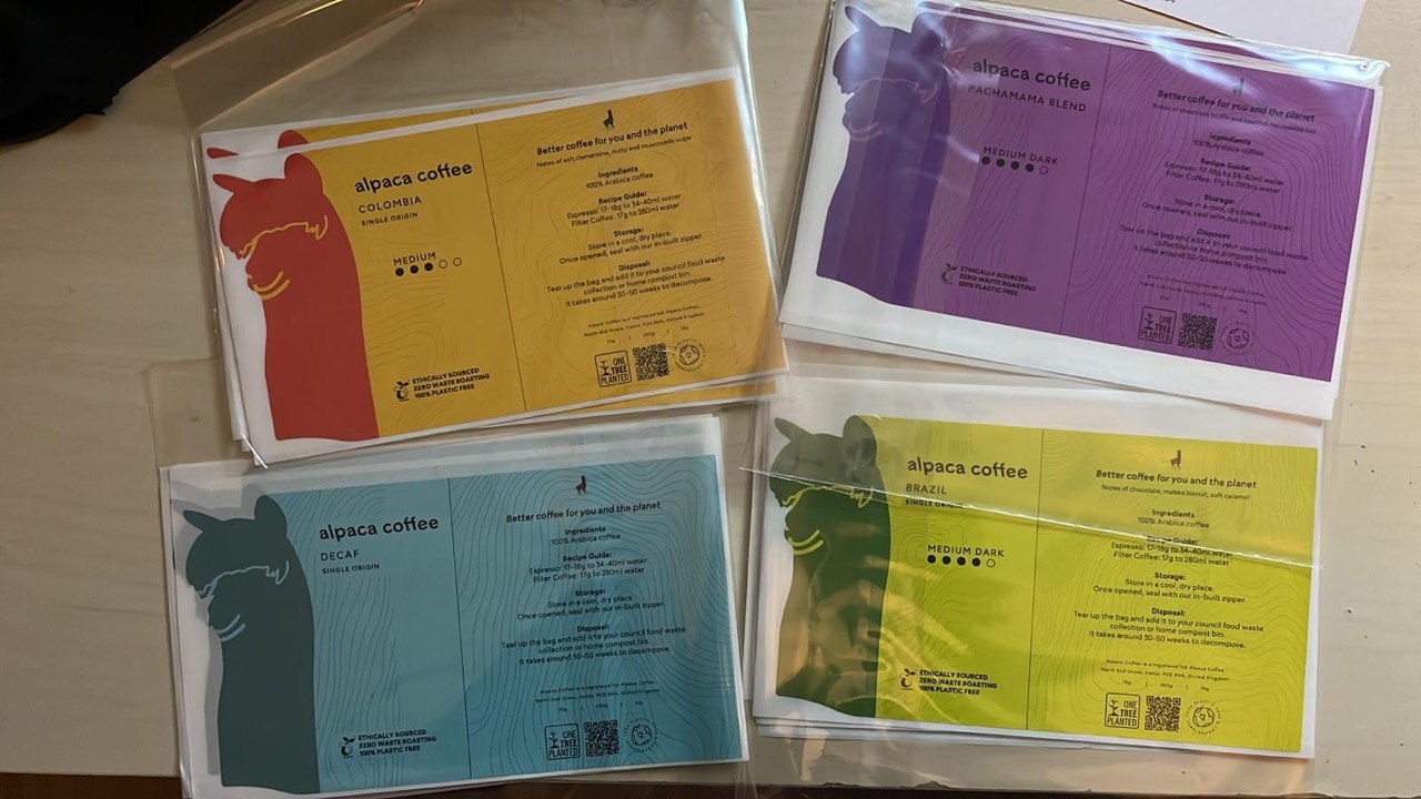
The system used a large alpaca silhouette as the immediate brand anchor, with origin, roast level, tasting notes and brewing guidance organised into a clear front-and-back hierarchy. A topographic line field gave the packs a sense of landscape and origin without relying on literal farm imagery.
Colour became the organising device. Each origin or blend could carry its own high-saturation field while retaining the same structural grammar: animal mark, product name, roast scale, ethical sourcing claims, QR code and composting guidance. The result was intended to read quickly online, on shelf and in small pouch formats.
The attached prototypes show the work moving between flat artwork, colour studies and physical sample packs: a compact brand world for coffee that is practical, bright and deliberately direct.